
Tag: Web Design company

Understanding the importance of a website for a brand
For a majority of businesses and organizations [referred to as brand(s) henceforth], their website is their most important tool. A website offers existing and prospective customers, collaborators and associates access to information which a brand wants to be accessed. Just like a departmental store categorizes products into different segments to ensure ease of access for customers, similarly, a website collates and displays information under different heads or pages to ensure clear representation of and easy access to each category of information, be it product listing, corporate announcements or contact details. The more time a visitor spends on a website opening different pages, the better are the chances of him/her getting engaged with the brand and performing the action desired by the brand such as product purchase or registration.
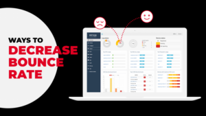
What is Bounce Rate?
While it is all good when visitors land on a website and scroll through its different pages, but what happens when a visitor opens a brand‘s website and exits from the landing page itself. Or what happens when the visitor leaves a webpage without performing any action such as clicking a link, making a purchase, filling up a form, etc. In technical terms, this phenomenon is called bounce with Bounce Rate defined as the percentage of visitors who exit a webpage without performing any action. A high bounce rate certainly does not bode well for a brand as it indicates a lack of interest in the brand.
Why is a high Bounce Rate bad & Ways to decrease bounce rate?
A high bounce rate indicates that the landing page is unable to retain the attention of the visitors long enough for them to become interested in exploring the website. This, in effect, hampers the brand’s engagement with them, resulting in a considerable decline in business prospects.
A high bounce rate doesn’t only hamper conversions but also affects the page ranking of a website on Google, at times shifting it beyond page 1 or 2, thereby vastly decreasing the chances of engagement. A high bounce rate clearly indicates that there could be issues with the website’s content, page layout, or user experience which are rendering it unattractive.
Digital Marketing Services to the rescue
While this situation would set the alarm bells ringing for any brand, it should not necessarily worry itself to death as there is a solution that can fix it all. A boon for any ailing website, Digital Marketing Services offers the easiest and the most comprehensive solutions for reducing the high bounce rate and increasing engagement on a website.
Digital Marketing Services play a huge role in solving the problem of a high bounce rate. They offer a range of solutions to optimize your webpage and in effect your website resulting in a decrease in bounce rate. Some of these are:
Speed optimization to reduce page-load time:
Digital Marketing Services help you understand that high page-load time is a major cause of high bounce Rate as no one wants to wait beyond 2 to 5 seconds for a page to load. Digital Marketing Services also guides you to bring this down by analyzing your load-time and then optimizing it to make it fast. Optimization can be done by:
- Using HTTP Compression
- Moving stylesheet references to the <head> of your HTML document
- Put Script References at the Bottom
- Minimize HTTP Requests
- Reducing 301 redirects
- Placing JavaScript and CSS in External Files
Content Optimization
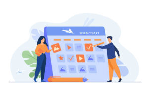
- Digital Marketing Services use Google Analytics and other such tools for in-depth analysis of landing page to understand bounce patterns and eliminate the cause
- Content optimization for SEO
- Reducing image size
- Refreshing information with relation to old content
- Cutting down traffic for non-targeted keywords
Interface optimization
- Improving the UI & UX for attention retention
- Designing page compatible for multiple screens including desktop and mobile
- Placing ads wisely to avoid jarring interface
Follow Us On Social Media:
There’s a decent possibility you’re perusing this article on your Smartphone. On the off chance that it’s actual, you are one of the many individuals who utilize their cell phones to get to the web each day. The developing significance of versatile web can be additionally evaluated from the way that Google itself revealed a massive update of its positioning calculation, requiring all sites, websites, and greeting pages to be portably advanced. Along these lines, it just bodes well for the organizations to have a solid nearness on the web and have a portable agreeable site.
Making mobile benevolent sites presents a layer of multifaceted nature that can be hard for some business groups. Along these lines, we’ve assembled some incredible tips to give you thoughts on the most proficient method to make your site versatile inviting.
The most effective method to Check Your Website’s Mobile Friendliness:
A portable neighborly site is a site that is a form enhanced for cell phones. It guarantees that your site’s substance and highlights will stack effectively on cell phones while offering the guests experience like a conventional site. Let us currently examine approaches to check your page’s versatile amicability.
There are three different ways to do it:
1. Open your site on a telephone or tablet and perceive how it functions.
2. Visit the Google Mobile-Friendly check page, enter your site’s URL, and snap on the dissect button.
3. Google likewise gives a free report inside Google Search Console, the Mobile Usability report, to help site directors change following the most recent portable inquiry calculation necessities.
Make Your Website Mobile Responsive:
A responsive site has a similar substance and data as the customary site. In any case, it is created in a way to give an excellent review understanding of a broad scope of gadgets. It guarantees simple perusing and route, absents a lot of need of looking over, resizing, and panning. Aside from giving your site a versatile cordial plan, a responsive structure is likewise useful for SEO. A place, which is enhanced for universal, will resemble this:
The strategy you decide to cause your site responsive will rely upon the time and cash you are happy to spend. There are three different ways to do it: It just methods adding a code to your template that advises the program how to show your site in various goals. Here is a case of a media inquiry
* Get an expert to do it for you
Organizations like NETQOM can help you discover experts who will carry out the responsibility so you can concentrate on other fundamental parts of your business.
Continuously Include A Viewport Meta Tag:
Viewport meta tag is a necessary code for your site to function admirably on a cell phone. There are a few setups that you can order your viewport to control. Here’s a case of what you can use at the leader of the report.
Think with your thumb (or forefinger)
Ensure your site is safe with one thumb and requires no squeezing to utilize. This is one of the most significant hints for any mobile site as you need clients to have the option to explore your site with their ‘telephone hand’ without the utilization of a second hand. Furthermore, if you need to squeeze to zoom, your substance is likely excessively little or not consummately upgraded for that perusing gadget.
Include Autocomplete Feature For Forms:
Autocomplete or autofill highlight can make a client’s association with your site increasingly helpful. If you have frames on your site that request name or address data, the autofill highlight will naturally include content into fields, taking the issue of composing in the message over and over. Here are how you can empower it in your manager settings.
- Check the “Autocomplete” checkbox
- Next, click on the “Spare All Settings” catch to spare your settings.
- Voila! You’re finished. After the Autocomplete includes is empowered in the editorial manager settings, you’ll see Autocomplete recommendations as you type in the CSS, JavaScript, HTML boards of the proofreader.
It is essential to do broad cross-program testing to guarantee that your structure functions admirably in various programs.
Make Your Button Sizes Large Enough To Work On Mobile:
It’s sufficiently simple to tap on a catch of any size with a mouse, yet the real test emerges when you click a little gem with your fingers. It gets significantly progressively troublesome if there are different little fastens near one another. It can’t be fantastic for the guests.
You can without much of a stretch location this issue by utilizing more excellent catches. Presently the inquiry is – how enormous do they should be? By and large, any interactive prize on a cell phone should be 45 pixels in height in any event.
Normalizing interactive zones and controls will have the accompanying advantages:
* Fewer blunders en route through your site.
* It will keep the watchers locked in.
* Potentially lead to more changes as well.
Utilize Scalable Vector Graphics:
To have a responsive plan, it’s fundamental to have Scalable Vector Graphics. Not at all like picture documents (jpg/png), SVGs are boundlessly versatile. Utilizing Scalable Vector Graphics guarantees that the symbols or designs will stay sharp over all the gadgets while never stressing over the goals. Likewise, since SVGs are frequently far littler record sizes, they can spare your site some heap time as well.
Pack Your Images And CSS:
Discussing the webpage stacking time, we as a whole need our sites to stack exceptionally quickly. Quicker burden time can mean the distinction between watchers remaining on your site or leaving. Speed is necessary for any place in this way, which implies having a portable well-disposed plan; it is required to pack whatever occupies a great deal of room on the site and eases back stacking time. This incorporates your high-goals pictures and your CSS.
It is prudent to utilize two distinct forms of a similar picture. For instance, a work area page may require a picture at 1200px wide for full goals, while the portable variant may need 400px wide. In this way, aggravate this on a page for a perceptibly quicker stacking experience.

WEB DESIGNING
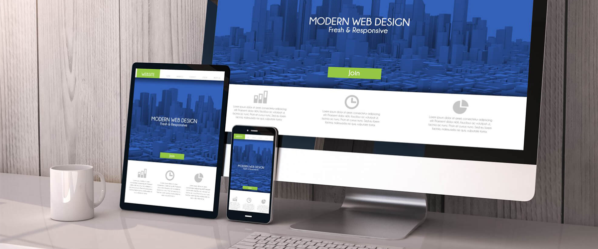
Web design is that which use to creating the website and whenever you search about it you get that on the internet. It normally refers back to the user experience elements of internet site development as opposed to software improvement. Web design used to be centered on designing websites for computing device browsers; however, because the mid-2010s, layout for cellular and tablet browsers has become an ever-an increasing number of important.
A web is working on the appearance, layout, and, in some cases, content of an internet site. After that you will get relates to the colors, font, and photos used. Layout refers to how information is established and categorized. A good web layout is simple to use, aesthetically pleasing and suits the user group and emblem of the internet site. Many webpages are designed with a focal point on simplicity so that no extraneous statistics and functionality that would distract or confuse customers appear. As the keystone of an internet clothier’s output is a domain that wins and fosters consideration of the goal audience, getting rid of as many potential points of personal frustration as possible is an important consideration.
Two of the most commonplace strategies for designing web sites that paintings nicely each on desktop and mobile are responsive and adaptive layout. In a responsive layout, content material actions dynamically relying on display screen size; in adaptive design, the website content material is constant in format sizes that match commonplace screen sizes. Preserving a layout this is as steady as feasible between devices is essential to keeping user believe and engagement. As responsive design can gift difficulties in this regard, designers must be cautious in relinquishing to manage how their paintings will appear. If they may be accountable for the content material as well, while they will need to develop their skill set, they’ll experience having the gain of full control of the completed product.
Web layout encompasses many different talents and disciplines within the manufacturing and renovation of websites. The different regions of the net layout include internet graphic layout; interface layout; authoring, which includes standardized code and proprietary software; the user enjoys the design and search engine
Web designing offers with the technique of growing a website. A net clothier use images, text, html5, Responsive internet layout, CSS3, records architecture, colors, fonts, and different interactive factors to supply a webpage. Web designers use markup language on the whole HTML for creating structure and CSS for presentation.
Web layout refers back to the layout of websites that can be displayed on the internet. It generally refers to the user experience factors of website development as opposed to software improvement. An internet dressmaker works at the appearance, layout, and, in some cases, the content material of a website.
Experts are agree with that Web Designing is hard for beginners. Coding and layout abilities are more in demand these days than ever before, but both learning and executing internet design may be daunting for beginners, novices, and specialists alike.
You don’t need to know topology or knot idea and any mathematics to do the net improvement. You don’t want for you to do calculus, trigonometry or linear algebra. And for the net development, arithmetic and primary algebra have to be the minimum.
Here are the important web design features and benefits.
1. Improved User Experience.
2. An Increase in Mobile Traffic.
3. Faster Website Development.
4. Easier Maintenance.
5. No Duplicate Content Penalty.
6. Simpler Website Analytics.
7. Better Website Loading Times.
8. Better SEO.
9. More social sharing
IMPROVED YOUR EXPERIENCE
You will improve your quality if your experience at work is increasing day by day. If your website has god scales and if you can change the screen size too then you will never face any trouble in creating a website and accessing menu, links, buttons or filling out the form. That’s why if someone has an experience you will do your work better and the user will spend more time on your website.
AN INCREASE IN MOBILE TRAFFIC
After searching they get that more of the 52% users of web internet on mobile. And you want to spend those users on your website then you have to create that type of design and compare the two numbers. Whenever you made it like that then you get that many of the mobile users are visit on your website.
FASTER WEBSITE DEVELOPMENT
You have to develop a website like that the website works fast on mobile also. Because sometimes many websites work slow on mobiles and they will refuse to use your website. That’s why you need to faster website development.
EASIER MAINTENANCE
It has two versions of your website and that’s why it divides the staff into two teams what they are on the development of the website. The works on maintenance tasks like marketing, customer services and many more.
NO DUPLICATE CONTENT PENALTY
One main thing you have to get that whenever you create two versions of websites then it will automatically create duplicate content. When you open the website of any version from mobile then you open the same if the URL is different
SIMPLER WEBSITE ANALYTICS
When you have two versions of websites then you have to search by website analytics that the customer which version is using from where it is coming from. Then you can easily send the Thank you tab, funnels and many more. That’s why simpler website analytics is used to analyze.
BETTER WEBSITE LOADING TIME
If you are working on the loading speed of the website and it is working well then all the users can use the website easily not only on the computers or laptops also on smartphones and tablets. It is very important because more than 53% of customers use the mobile for opening the websites.
BETTER SEO
You will get better SEO if your web design search is working well day by day on the search engine rank page. Make sure it’s on the top always but if your website is not good that much then your website goes lower position on the result page of the search engine rank page and your mobile users never able to use it properly.
MORE SOCIAL SHARING
When you have done the website step by step then you can share your website on social media in a very good way. By the use of marketing, advertising and doing many more things to get the new audiences new customers to search for the website. And then you can easily share your website on laptops, mobiles and many devices.
WEB DEVELOPMENT SERVICES
Web development broadly refers back to the tasks associated with growing websites for web hosting through intranet or internet. The internet improvement method includes web design, internet content improvement, client-aspect/server-aspect scripting, and network safety configuration, among other tasks.
There are seven value-added web development services as below:
• Analytics Interpretation and Reporting. You’ve designed the site with a web analytics code in place and the site usage is being tracked.
• Competition Monitoring.
• HTML E-mail Template Design.
• Blog Customization/Management.
• Pay-Per-Click Campaign Management.
• Sales Presentation Development.
• Usability Testing.
If you need any help you can contact on web designing & development services by the using of helpline contact number: (877) 947-8577

Designing tools help a lot in saving time and energy you put in your work by streamlining workflow. A smart designer always makes his work smarter, rather than harder. So it’s best to use good design tools to stay ahead of the game.
These tools come in the form of desktop programs, browser tools and SaaS apps.
Have a look at some of these brand spanking tools prevailing in the market.
Adobe XD
Adobe XD is measured in terms of a tough alternative to Photoshop. Adobe XD is developed for particularly for mockup designs.
Sketch
Sketch is Adobe’s greatest rival in the outlined space. For a considerable length of time, everybody utilized Photoshop for mockups in light of the fact that it was only the most straightforward arrangement.
It’s substantially less expensive than the majority of the Adobe items and you can get it for a one-time charge, not at all like the month to month membership necessities to Adobe CC.
Figma
Figma is an interface configuration device that empowers various planners to work together progressively. It’s accessible in the program, or on Windows, Mac or Linux, and there are both free and paid adaptations relying upon what you utilize it for.
Affinity Designer
Affinity Designer has been named the ‘Photoshop executioner’ by a few. The application is extraordinarily all around planned and feels like it’s been made to be a committed web and visual communication instrument.
Principle
Principle is UX animation software that runs on Mac only. It is the best medium to bring more life to web designs. The principle has become the top pick for designers one can import files to Principle without any trouble.
Webflow
Webflow is much more than a visual editor. Webflow is a complete package of CMS engine, hosting and client access. Give it a test if you want to try something different.
Moving Forward
The best way to stay over the top of the game is to speed up your game with all the best tools. Use any of these tools and give a strong boost to your designing career.

2018 has brought an acceleration of many newest technological trends that have fostered a hefty foothold in the mainstream market.
Changing digital trends will bring a technological shift in 2019 that would take into account countless leeway of possibilities.
These technologies will act as a compass of technical shift as we round the bend of 2018.
Here is the list of megatrends in technology that is going to underpin everything that we need in 2019.
Blockchain
Blockchain has certainly gone the long way apart from virtual money only. It has now laid its strong foothold in the Governance System, Real-Estate Market and Banking Sector.
The blockchain is estimated to generate the business value of $3.1 trillion dollars by 2030. It is swiftly extending the category of technology that is going to generate abundant healthy-package jobs in coming years.
Artificial Intelligence
Artificial Intelligence (AI) has been the subject of high-pitched buzz over the past few years. AI with its self-study capabilities is helping many businesses go in-depth accurately detecting customer’s preferences. AI is basically eliminating the need for human intervention
Augmented Reality
Augmented Reality (AR) has infused life into the mixed reality spectrum of the virtual and real world. The most popular device using AR tech is Google Lens that adds an element of both tech and entertainment. AR is highly useful among professionals for coordinating tasks.
AR got tons of uses for enterprises and it is far better than VR.
Wearable Technologies
Wearable technologies have surely gone over the mainstream over the past few years. They just let you tap into yourself with a click of the button and now even act as a real-time interpreter with the advent of Google Assistant and more. The worth of wearable devices is mounting with the added functionality of clipped to the body or hung around the neck.
Digital Twin Technology
Digital Twin is gaining wide acceptance again with the help of Internet of Things. Digital Twin gives the virtual model of product, process or service. It helps in preventing downtime and cut-off the problems even before they appear by analyzing data and monitoring of systems.
Wrapping up!
These technologies are definitely going to make jobs more meaningful in 2019 with improved digital communication and economic opportunities.
Technology keeps on changing. From progressive web apps to the static sites, we will now have a look at the trends that web developers can expect during the year 2020. All the trends and changes just have one aim of getting succeed. To guide and help you more we have come up with some web development trends that you can expect to see in 2020:
Chatbots
Connection with the users is of utmost importance. For this chatbot are there which is a written & oral conversation software. This allows any website to get connected anytime daily without maintaining the customer service department. With the help of chatbots, communication has seen new capabilities. Now answering to customers, redirecting them to the relevant pages or sites along with helping them in completing a transaction. The customers would like to have chatbots on every site as they make communication easy and simple.
Progressive web apps
These are the apps that take the benefit of the features of any internet browser with the help of a mobile application interface. The benefit of this technology includes the ability to work offline, no load time, ability to receive notifications and good reliability. Even the designing of these apps is also faster than any other mobile app. Also, they are easier to maintain and deploy which is beneficial for both developer and the user.
Web Notifications
These are the best tool for the mobile apps. This is the ability to send information directly to the interested users I becoming popular soon in all the areas such as traffic or sports or any promotional sales. This can also with websites after the authorization of the users.The benefit of this tool is better customer engagement without any additional cost.
One Page sites
These are sites that have one very long page. One of the biggest benefits of these sites is simplicity. This is the concept that works very well on the mobile phones since scrolling on these devices is very easy. This is the modern solution for online needs and easy to develop & host.
Static Sites
This is very site as each page is encoded n HTML and displays the static content f each visitor of the site. These are sites that are secure, fastly loads, and reasonable to develop. These are popular because of their simplicity.
User interfaces in Motion
This technology will give a big range of customization along with a wide array of options to the developers for developing an eye catchy and functional website.
Release of Flash
Flash allows the developers to add animations and other movements to the site. Flash initially came with Adobe became popular but when it came to HTML 5, it gains a lot of popularity and is becoming the universal internet format.
To Conclude
Trends move as fast as they arrive, as the evolution of the technology. These new features can be used for attracting and retaining the customers. This is the reason to look at the new ideas and the trends that will help in staying ahead in the competition.

A Content Management System is a platform where arrays of related software programs are compiled to create and modify the digital content. A Content Management system is particularly used in Enterprise content management and Web content management. As of now, we are surviving in a content-based nation where all the users are demanding consistency and proper reliability. So, its become a necessity for every professional or entrepreneur to invest in Content Management System which supports in delivering more precise and consistent experience to our customers.
Over the period of time, CMS become a basic requirement for every website as it help the administrator to edit, modify and maintain the website end to end, all across the pages. It encourages the user experience effectively in using the website as it will automatically sort the fresh content to the user. Basically, there are two main CMS which affect the user experience such as Drupal and Kentico. These CMS helps the user for powerful and effective experiences.
Features of Content Management System
There are various tremendous features of CMS which change the world rapidly such as:
- For easy access, CMS have Intuitive indexing, search and retrieval options through which all the data being indexed very easily and you will be able to search by entering keywords, names of authors and many more.
- Using CMS, now you can easily change the format of your documents, for instance, you can change the scanned document and legal documents into the HTML or PDF documents.
- CMS can edit, update and modify the content after the first publication this feature is called Revision which tracks and keep the records of the changes done to the file.
- It also has an exciting feature known as publishing functionality which allows the user to access templates after proper approvals and authorizations and to create or modify the content.
Popular Attributes of Content Management System (CMS)
- SEO-friendly URLs
- It has Group-based permission systems
- Minimal server requirements
- A Composition of file managers
- Content ranking with unlimited depth and size
- An Expert panel with flexible support
- Simple procedures for installation and updating the versions
CMS requires a multilingual, flexible shifts support team to manage and maintain the operations of websites. The range of controlling the content either from the user or administrator should be considered important while using CMS. Using CMS, all kinds of digital content can be indexed very easily.
If you are looking for any further information, then you can take help from our digital solutions provider team by simply write us on info@netqom.com.

Nowadays, Content Management System, popularly known as CMS are usually adopted to create websites. CMS is a computer application that provides access to create and modify the digital content. It is mainly used for the websites where the contents need to change very frequently. CMS can be used to manage the content which contains photos, videos, audios, maps, graphics that represent content and interact with the user. Every CMS is compatible with ready to use Administration Section
Content Management System enables anyone to modify the content by editing, adding or removing contents, images from the particular website. There are different Content Management Systems available in the market, but very few among them are open source which is very favorable for e.g. WordPress, Joomla, and Drupal, etc. Netqom developed, customized and implement many CMS based websites and portals prosperously.
Characteristics of Content Management System:
- CMS is really fast, flexible and free of cost solution.
- It can be easily managed as it provides SEO-friendly URLs.
- It can be accessed by anyone as it supports Multilingual.
- It is really secure and stable application for the user.
- It promotes the functionality of the user or group of people who used it.
- It integrates and provides online help support.
- It is fully featured and friendly user.
Why use CMS?
- Content Management Systems have an array of free or paid modules available. These modules can be installed without a hitch and integrated with CMS to add new feature or functionalities.
- Most of the Content Management Systems actively upgrade one version to another.
- The popular Content Management Systems have Open Source versions which are supported by active Communities.
- CMS is easy to understand and use Administrator section. The Administrator section enables anybody who is not familiar with HTML to Add, Modify or Delete the contents from the website.
- It displays the contents of the website from other sources by the News feed managers of CMS.
- Highly scalable CMS platform having stable integration with third-party systems that helped in expanding the website traffic through SEO optimization.
Netqom Benefits:
- It has a quick response design for multi-channel support.
- It is embraced with hardware sizing and hosting capabilities.
- It integrates third-party solutions in domains such as video, images, newsletter and commenting etc.
- It customized frameworks and accelerators for quick implementation.
- Audience research, Infrastructure optimization and content personalization can be analyzed using CMS.
It is of foremost importance for the users of a website to clearly view and navigate it clearly without the interference of design as well as usability. But with reasonably good web design, there is hardly any chance that you may face any such issue.
The below given are some of the most prominent benefits of a good web design to your site:-
Improved Google ranking:-
Responsive Web Designs are basically known for helping you achieve higher ranking in popular search results such as Google. Are you not building a website in order to get more leads as well as traffic to your site? Getting a business website created is of foremost importance for all the business owners. A business would surely benefit from the traffic or leads that it receives, regardless of its size. Experience how such a web design can work do wonders both for your site as well as your business. With these your site can be viewed clearly on all kind of electrical devices such as tablet, smartphone or laptop. If your website design is responsive then you need not create another version of your website to read well on mobile device.
Promotion of sales:-
As discussed earlier is a good web design must always focus on receiving more traffic as well as lead as it ultimately promotes the sales of a product. A responsive version of a website can save much cost as you need not create various versions to work effectively with various kinds of devices. It ultimately enhances user experience. It enables internet users to view your website with ease from any device. Consistent user experience leads to more sales.
Better user experience:-
As you improve the user experience of your site consider your site to receive more traffic as well as revenue. The pages and blogs available on your site would also witness an increase in the amount of organic search traffic. The return of satisfied customers on your site would result in more sales and revenue.
Use analytics to save time:-
If your website is available in various versions that is tracked in Google Analytics then you can save lot of time money as well as effort by include the results of all the analysis in one single report. With this method it is would be easier for you to track your users of your products or services and monitor them in a much fast and effective manner.
Save money with mobile development:-
Maintaining a website surely much less costly as well as easier in comparison to creating multiple sites. With one good web design you can make required changes to the already existing website or create a new one with an aim to promote the sales of your website.
Summary:-
A Professional Responsive Website Design also significantly reduces your bounce rate by properly formatting your site. In case it is not formatted for all kinds of electronic devices then the users of your products would leave your site in no time.